Creating a new way to control your home
Overview
Smart home systems give users powerful control and insight into their homes, but many platforms feel overwhelming, confusing, and spread across too many places. Users want one simple space to manage lighting, temperature, devices, and home activity without the usual frustration.
Homify is designed for adult homeowners and smart home users who:
Want to easily understand their home environment at a glance
Need simple but powerful tools to control and monitor devices
Feel overwhelmed by scattered systems and confusing dashboards
Role: UX/UI Designer
Timeline: 5 weeks
Tools: Figma
Project Type: Concept project
User Needs
Users need a clear summary of what is happening in their home, what devices are active, and what actions to take next, without technical expertise.
Research
To understand how users interact with smart homes, I reviewed existing dashboards, studied competitor platforms, and gathered feedback from active users. Many people shared that managing devices feels powerful but not always simple, and important controls are often hidden behind layers of navigation. Research confirmed that users wanted clarity, organization, and reassurance rather than complexity.
The Problem
Smart home technology gives people powerful control over their homes, but the experience of managing it is not always intuitive. Users are forced to navigate multiple apps, learn different systems, and constantly work to understand what’s happening in their home. Instead of feeling confident and supported, the experience can feel fragmented and overwhelming.
As a result
Process
The design process focused on simplifying smart home management while preserving depth and functionality. I explored layout systems, interaction patterns, and visual hierarchy to ensure that essential features stayed clear and approachable.
Wireframes, iterations, and feedback helped shape a dashboard that balances control, simplicity, and confidence.
Design Goals
Comparison
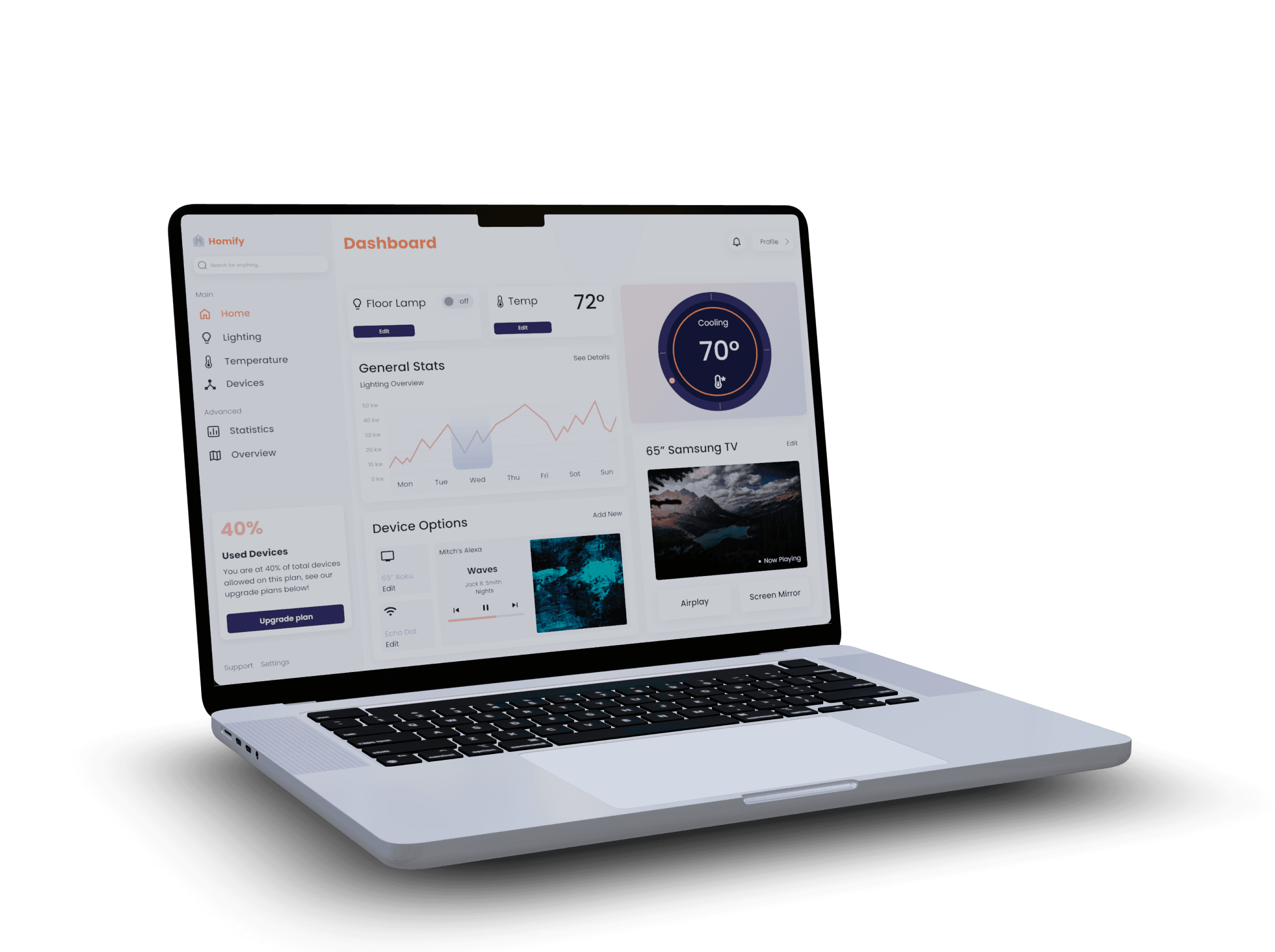
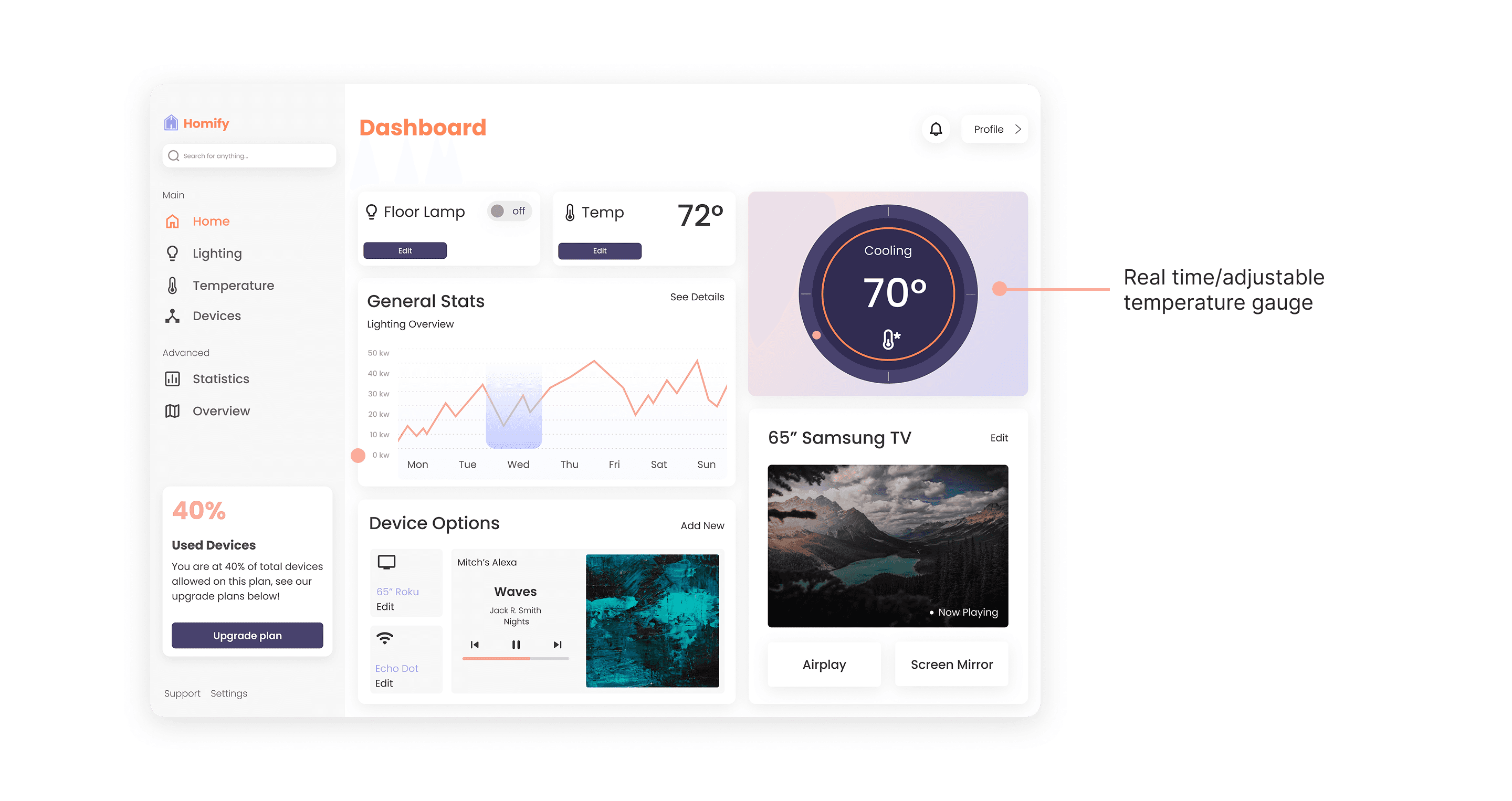
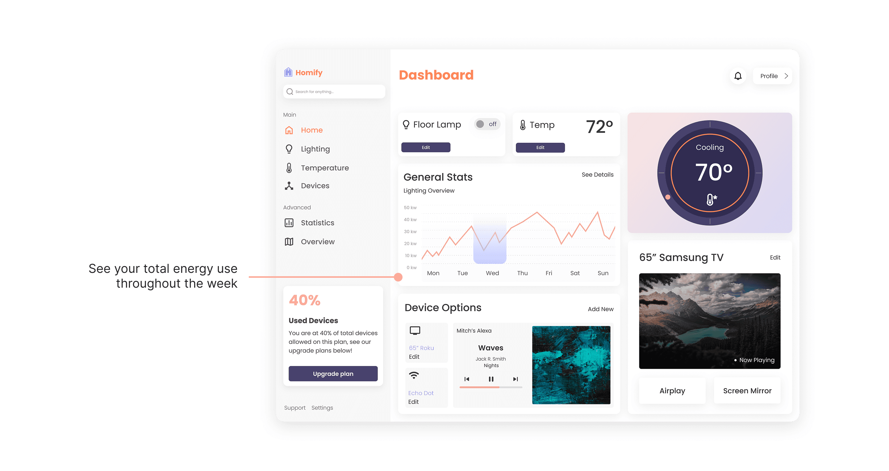
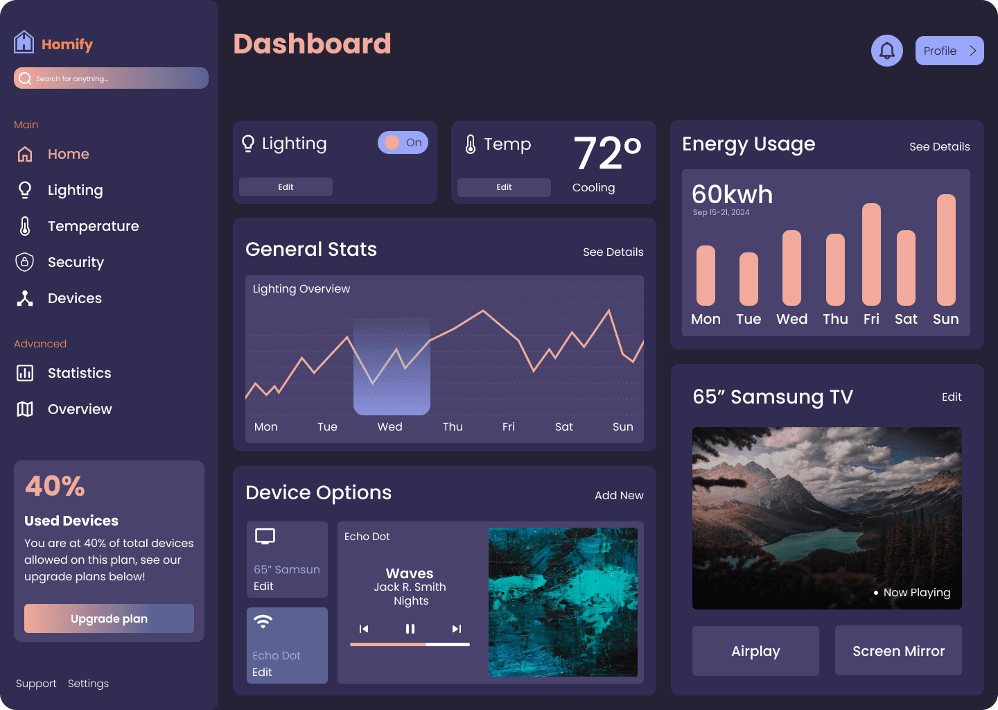
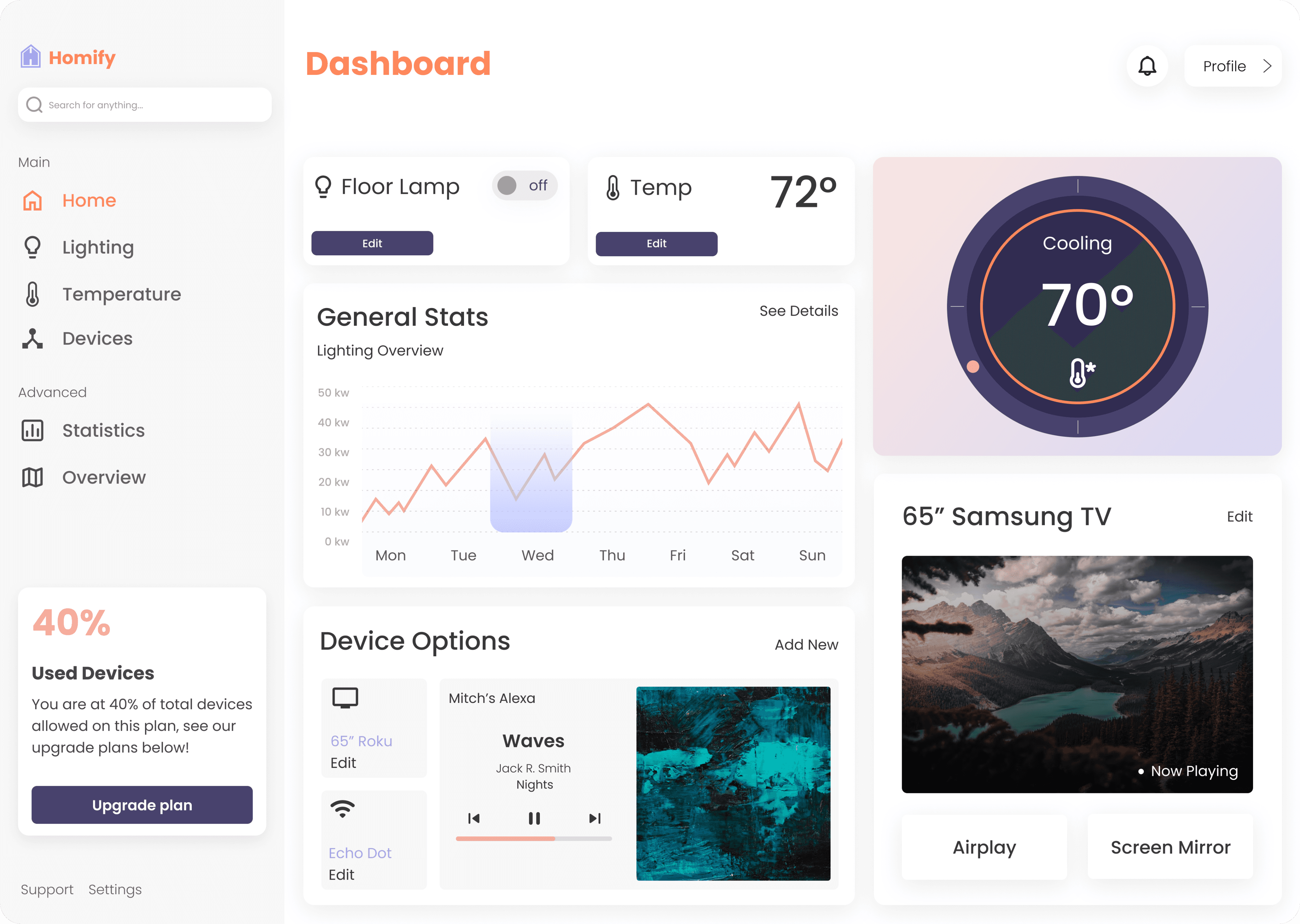
The first iteration was created in 2024 as a student project. I then revisited it a year later and revised the visual design, along with how the interface functioned for users. For example, I added an interactive temperature gauge, removed unnecessary colors, and improved the graphs with clearer and meaningful information.
Before
After
Impact & Reflections
Performance Against Objectives
The design improved clarity, reduced confusion, and helped users feel more comfortable interacting with their smart home systems. It successfully created a structured and understandable dashboard experience.
Impact on Users
Users now have a single space to monitor activity, manage devices, and understand what is happening in their home. The experience supports everyday tasks and helps them feel more aware and in control.
Lessons Learned
Designing for simplicity requires careful decisions about what to highlight and what to reduce. Clear hierarchy, thoughtful structure, and visual communication play a huge role in user confidence.
Areas for Future Improvement
Future opportunities include expanding personalization, improving automation features, and offering deeper insights into performance and energy use to support smarter home management.
Thank You!
This project strengthened my approach to designing clear and supportive dashboard experiences. It was an exciting challenge to turn complex technology into something intuitive, friendly, and meaningful for everyday users.